FLYING MACHINE

CASE STUDIES
SINCE 2004
1.0.1
ICX
OVERVIEW

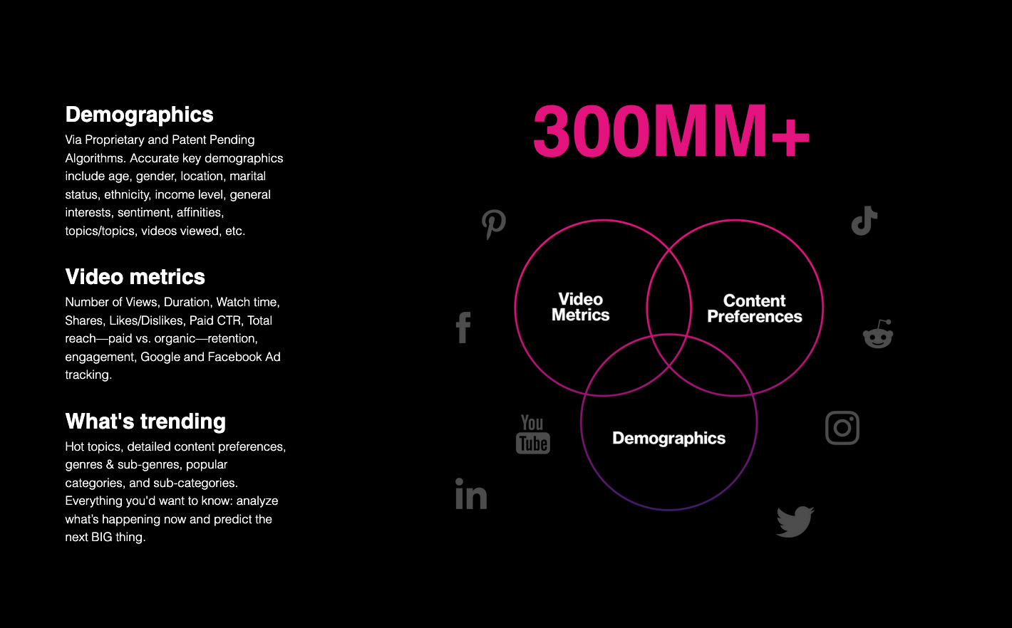
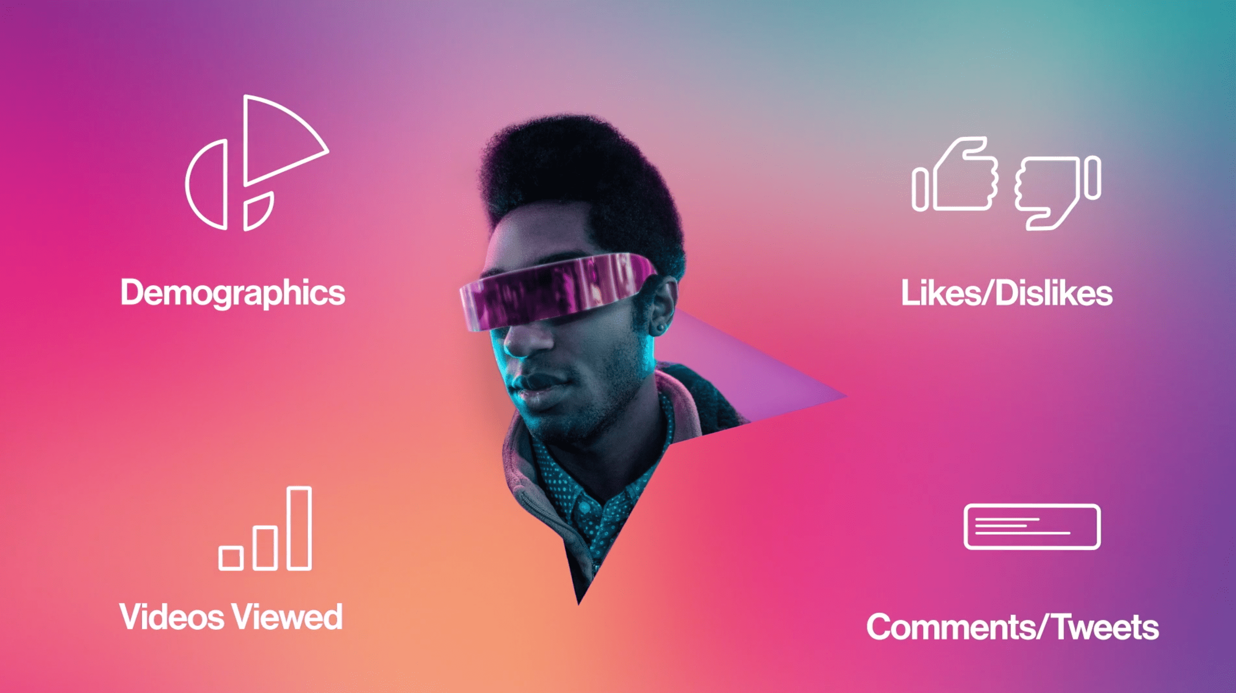
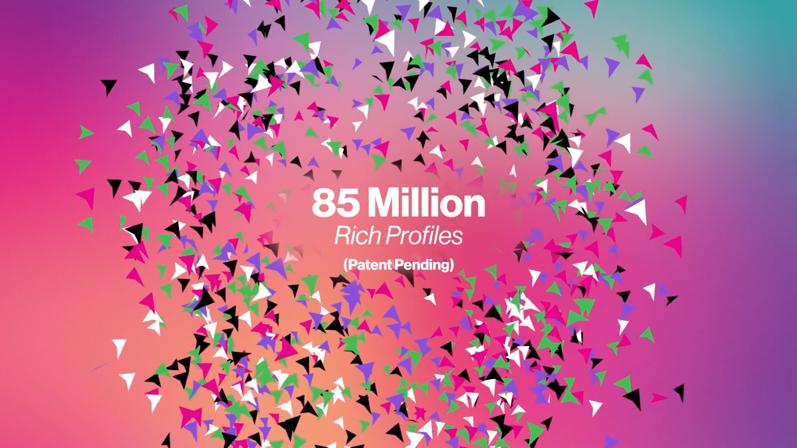
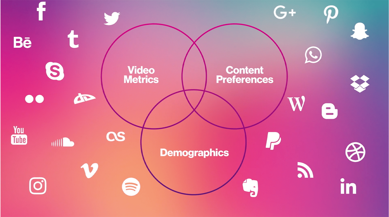
ICX is an intelligence, analytics, and activation partner committed to helping brands, agencies, and media companies stand out and deliver amazing data-driven content. It boasts a team of industry veterans who merge human and artificial intelligence to navigate the vast data-verse that connects video creators and video consumers across every platform. ICX delivers audience intelligence, predictive content analytics, ready-to-license audiences based on Rich Profiles, and high-performance audience activation plans. They operate in a market saturated with companies offering similar yet inferior services to clients.

CHALLENGE

The company faced barriers to growth because people were conflating what they do with companies who do traditional data analysis, social listening, and other types of market intelligence. They lacked a simple, strong messaging hierarchy that quickly explains their unique value proposition. Additionally, the company’s website, sales deck, and overall identity felt outdated and cluttered.

SOLUTION

Flying Machine created new positioning and messaging that focused on the global reach of Starhome’s Service Mobility offering. We also redesigned their visual identity package to create a bold, distinct, clean brand that clearly communicated their global dominance in this sector.

RESULTS

The refreshed brand was an instant hit with company employees, the board of directors, and with clients old and new. The new messaging and fresh copy helped ICX distinguish itself from the competition while defining a market category that they can grow to fully own.

PROCESS

As in most of our rebranding projects, we started with a deep dive into the essence of the brand and spent a considerable amount of time studying the market and understanding the ICX offering. The breakthrough for us happened when we realized that ICX offers clients full control of the entire data loop that connects brands with consumers. Once we distilled the brand positioning we had the basis for a new brand language that drove the next phase – a full exploration of all aspects of the brand identity. We focused our brand identity study on dynamic shapes that connect the worlds of video content with data and activation. The resulting logo captured all three worlds succinctly and the new brand identity provided the design direction for the website, as well as all the other elements of the visual identity system

Flying Machine created the sitemap as well as a robust wireframe that informed the design of a brand new website fully conceived, created and executed by our team. The new website was further enhanced by the original animated video that we created from concept to final product. This short format video animation successfully conveyed ICX’s value proposition through vivid images and sound. This robust project was managed on a very tight timeline based on the client’s needs. Our international team was able to work around the clock to complete the delivery and stay ahead of client expectations.

STARHOME
OVERVIEW

Starhome is the leading provider of roaming services and converged solutions for Wireless Network Operators. The company’s portfolio includes inter-network convergent solutions for fixed, IP, and wireless networks, in addition to a wide variety of international roaming services. Starhome’s global footprint includes the world’s largest Operators and Groups who together provide seamless Service Mobility for more than half of all roamers worldwide.

CHALLENGE

Starhome recognized the limited growth potential of its legacy roaming business. Flying Machine was commissioned to convey Starhome’s shift in business strategy and expanding product line, which included rapidly growing solutions with higher profit margins – a critically important factor that helped achieve the company’s goal of a higher valuation for the ongoing M&A process.

SOLUTION

Flying Machine created new positioning and messaging that focused on the global reach of Starhome’s Service Mobility offering. We also redesigned their visual identity package to create a bold, distinct, clean brand that clearly communicated their global dominance in this sector.

RESULTS

The resulting brand identity yielded a simple image, that is clear and inspiring, and easily communicable to customers, staff, and the investment community. Starhome’s repositioning and brand refresh received rave feedback from current and prospective customers. The Service Mobility concept positioned Starhome as the de-facto provider of a true solution for an identifed gap within customers’ needs. The company is reinforcing and enhancing its industry leadership position with improving renewal rates, a rapidly growing customer base, and an ever-expanding global reach. Flying Machine’s brand relaunch was well received within the investment community as well and Starhome is now perceived to be a next-generation technology and service enabler, elevating the company’s position to a peer group with higher multiples and improving ROI to shareholders.

PROCESS

Flying Machine focused on identifying Starhome’s prospects by looking beyond the company’s customer base and target markets, and meeting its Investor Relations, Marketing, and internal communications needs. Flying Machine collaborated with Moxie, a brand consulting firm, in a detailed research and analysis of Starhome’s business. Using extensive primary and secondary research, Flying Machine gained deep insights into Starhome’s vision, ability to deliver on its promise, and competitive advantages. Based on interviews with Starhome’s management team, sales force, and client executives, Flying Machine developed an in-depth understanding of the company’s strategy, competitive landscape, core values, and brand attributes. These insights were captured in a creative brief, guiding strategic development and creative implementation.

OnSSI
OVERVIEW

OnSSI was a young startup company when it launched the Ocularis Video Management Software. Used in the surveillance industry to monitor multiple cameras on a single interface delivering video over IP networks, the software offers a robust work tool for the Chief Security Officer. The tool is used in a large variety of installations – from schools and hospitals to warehouse and transportation hubs, to even larger environments like massive refineries and entire municipalities.

This market is highly competitive and extremely complex, reminiscent of the PC market of the ’80s with competing companies that are often forced to collaborate while trying to one-up each other. The product is not sold directly to the client but through a network of integrators and distributors.

CHALLENGE

In an already confusing environment, the Ocularis brand was further complicating matters with convoluted brand architecture, an outdated identity, and confusing messaging that was only intelligible to engineers. The company was at risk of losing market share to two publicly traded giants even though in many cases it had superior technology.

SOLUTION

Although we were initially contracted for a corporate brand revitalization, our market research and positioning efforts resulted in a complete reorganization of the product line architecture. The next step was to focus on the company’s flagship product Ocularis. We recreated all Ocularis branding and communications, and in the process developed an entirely new website complete with dedicated areas for integrators, channel partners, and customers.

As we delved further into the company’s communications, we recognized a significant customer service challenge. OnSSI’s global customer base frequently required instant customer support solutions regarding the installation and maintenance of the software product. However, the global reach of the customer base meant that customer service needed to serve many different time zones. We decided to create a mobile application written from an IT perspective so that common daily questions could be resolved immediately at any time of day. Customer satisfaction ratings soared and the application was a huge hit.

Over the next seven years we became OnSSI’s acting marketing department for all their daily needs including business development, print and web communications, through their eventual M&A process with Qognify.

RESULTS

The concentrated rebranding effort and ongoing brand maintenance across all touchpoints elevated the Ocularis brand to its rightful place as a formidable competitor to the publicly traded conglomerates. The clear and compelling brand communications helped the company secure a round of investments that led them to a successful acquisition by Qognify in 2019, thereby expanding their global reach even further.

PROCESS

Flying Machine kicked off the brand revitalization by working closely with top management starting with the CEO and founding partners. In the first phase we worked together to rediscover the core essence of the company. In many ways, OnSSI still retained its startup spirit although it was buried under the complexities of the industry and the day-to-day work. Our first order of business was to articulate this essence internally and remind people of the greatness that was at the heart of this technology company. We chose to pursue a more whimsical approach and created a comic hero based campaign that launched throughout the company’s offices. The campaign successfully boosted employee engagement and paved the way for a fresh new approach to external communications. Our next step was to evaluate the entire product line architecture and restructure each offering including nomenclature, hierarchy, and relationships to other company offerings. We created bold, memorable names and typographic options for each product and tier.

New literature was developed that streamlined company and product information, product features, relevant industries, and unique benefits. From an abstract offering, we went to razor-sharp selling points that helped the sales force approach clients in relevant industries with confidence. Overhauling the website came next. We mapped the old site and used analytics tools to define the best performing areas and then recreated the new site with the information while developing additional sales and customer engagement tools. These included a variety of performance calculators, a database of parts, and a library of how-to videos. Simultaneously, Flying Machine also worked to develop and launch specific campaigns to support new software updates, new product launches, and trade shows. This project presented a long term strategic branding challenge coupled with quick tactical solutions to support the day-to-day activities of the company and its sales force. We helped introduce a culture of clarity, transparency, and benefit-driven communications compared to the old feature-driven approach.

TUCKER
OVERVIEW AND CHALLENGE

As Baby Boomers are entering their senior years, they are now facing many of the same safety at home concerns of previous generations. But boomers are seeking a more stylish, better designed product vs the old ‘Help me I’ve fallen and I can’t get up’ alternative. We recognized that the language, tone, visual identity, and overall design of the product and brand play a role as important as the actual life-saving service it offered. Everything from the brand name, through the product design and supporting communications, was recreated with the promise of a loyal helper that affords confidence and style alongside a technologically superior and trusted solution.

NAMING

We looked for a name that would be easy to pronounce – something that literally rolls off your tongue and assures you that you are in good hands. Our research led us to cultural references of the 60’s and 70’s before we eventually decided to focus on a different direction – man’s trusted best friend. We searched though the Top 10 dog names in the US and just like that, Tucker was born. In addition to the name itself, we went after the dated terminology and replaced “medical alert” with a “personal emergency response system,” or PERS.

LOGO AND CORPORATE ID

The visual identity married several key symbols: Tucker’s uppercase “T”, the ubiquitous EMS Star of Life that anchored the brand in life-saving urgent care, and the 3-dimensional coordinates grid supporting the “Go bravely” motto. The saturated blue-gray-white palette feels fresh and contemporary while projecting a sense of calm and control. The bold minimalist look of the new corporate identity and product design uniquely conveyed its point of differentiation – a sophisticated and sexy technologically superior solution for a discerning audience.

WEBSITE

The clean contemporary website offered a complete departure from traditional medical alert websites. We focused on conversion as we cleaned up unnecessary text and replaced outdated and poor-quality imagery with aspirational photography and overall design that’s closer to a smartwatch than to a medical device.

We complemented the minimalist product photography and lifestyle shots with original illustrations that helped convey the product’s unique benefits.

PRODUCT DESIGN

Our goal was to truly stand out and make Tucker’s new generation of customers feel like they were wearing a stylish, quality gadget. We insisted on streamlining the internal components before looking to the outer design, which gave us the freedom to rethink the casing altogether. Our industrial designer had just finished designing an Italian sports car so it was only natural to let it inspire Tucker’s aluminum shell. Evocative of key-less luxury car remotes, the free-flowing easy-to-hold shell features a cool blue light around the emergency button that makes it stand out clearly without resorting to the traditional red plastic of the past century. The final design was flexible enough to be worn as a pendant, on a keychain, or around the wrist like a futuristic fitbit.

FORM
OVERVIEW

FORM (formerly Worldapp) is a configurable, intelligent mobile technology solution for global enterprises for inspections, audits, and surveys. It helps field personnel and managers to intelligently capture information, meet and master data management and workflow challenges. Diversis Capital – a private equity firm – acquired the company in late 2019 and hired us to rebrand the company to be better positioned to highlight their technology’s advantages and benefits in a multi-billion dollar industry that was suffering the effects of the global pandemic.

CHALLENGE

The company’s dated marketing and messaging were not in-step with their advanced technological offering and lacked critical focus on the clients and their challenges. Furthermore, there was a fractured brand architecture with various companies and splintered messages under the original Worldapp umbrella. The brand identity, website and presentations were outdated and burdened by extensive amounts of content that simply did not serve their needs.

SOLUTION

Flying Machine performed a complete market audit to reposition the strategic messaging as well as an entirely new brand essence, story and architecture which consolidated all brands under the name FORM. We launched a modern, sleek brand identity with a focus on succinct messaging that highlighted the company’s unique sales propositions. Working with the sales team, we crafted a variety of elevator pitches and sales presentation templates to help them hit the ground running with the new brand image. The new messaging strategy organized the complex offering around industry-specific pain points and unique solutions.

RESULT

The refreshed brand was fully embraced by all the stakeholders in the company from the CEO to the product development and sales teams. As the company restructured their team and onboarded new sales and operations personnel, the new branding and messaging played a critical role in getting the entire team cohesively focused on the product’s advantages and ready to capture more market share. In addition, the strong positioning and bold presentation played an important role in the company’s subsequent acquisition of industry competitor GoSpotCheck.

PROCESS

As in most of our rebranding projects, we started with a deep dive into the essence of the brand and quickly immersed ourselves in a 500 page BCG study supplied by Worldapp. More than gleaning some of the unique advantages of the company’s technology and customized solutions, we worked to extract the story from the data and find creative ways to connect the pre-Covid19 study with the realities on the ground. We conducted stakeholder interviews with different department representatives and took the time to really connect with each person with the goal of getting much more than their professional views. We believe that people’s feelings play a crucial role in the success of any branding project and our work was as much about sharing the experience of everyone involved as it was about guiding the process and helping people to open up to the coming changes.

Our TOWS analysis reversed the traditional SWOT analysis to evaluate the brand’s ability to meet the extreme new challenges their clients were experiencing and expertly adapt to radical new working conditions. This meant that our positioning wasn’t based on how we would have liked to see the company from within, but how the company needed to position itself to be in harmony with the external forces operating in the marketplace.

Before setting out to recreate the marketing tools, we dedicated time to reorganize the cluttered nomenclature that characterizes the datacollection industry. We streamlined dozens of verticals and use cases to three main buckets that were easy to remember and even easier to convey in sales decks and client presentations. Recognizing the challenges facing the marketing and sales teams, we created cheat sheets that helped them customize their elevator pitches according to the nuances of each prospect.

Lastly, we consulted the marketing team on their online marketing strategy and web development, stressing a simpler UX built around the way clients actually use their website during the sales and evaluation process.

IN MOTION
Thank You!